
Designing Comfort for Injured Athletes Lost in Recovery
Injured Athlete’s Toolbox (IAT) helps athletes navigate their injury through healthcare guidance, mindset tools, and personal stories; however, the site was packed with text-heavy pages, buried valuable content, and a confusing navigation system. Overwhelmed users are seeking for empathy, credibility, and quick answers.
My goal is to simplify the content structure so users can find what they need easily.
My role: Freelance UX/UI Designer
Tools: Figma, Illustrator, Photoshop, WordPress
Date: May 2025
Overview
Problems
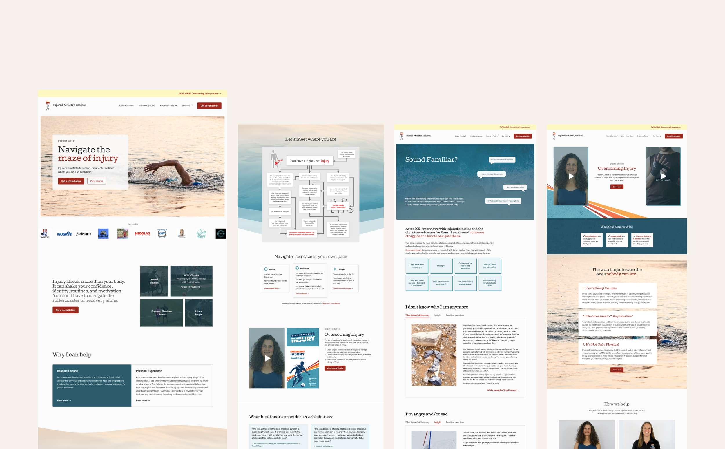
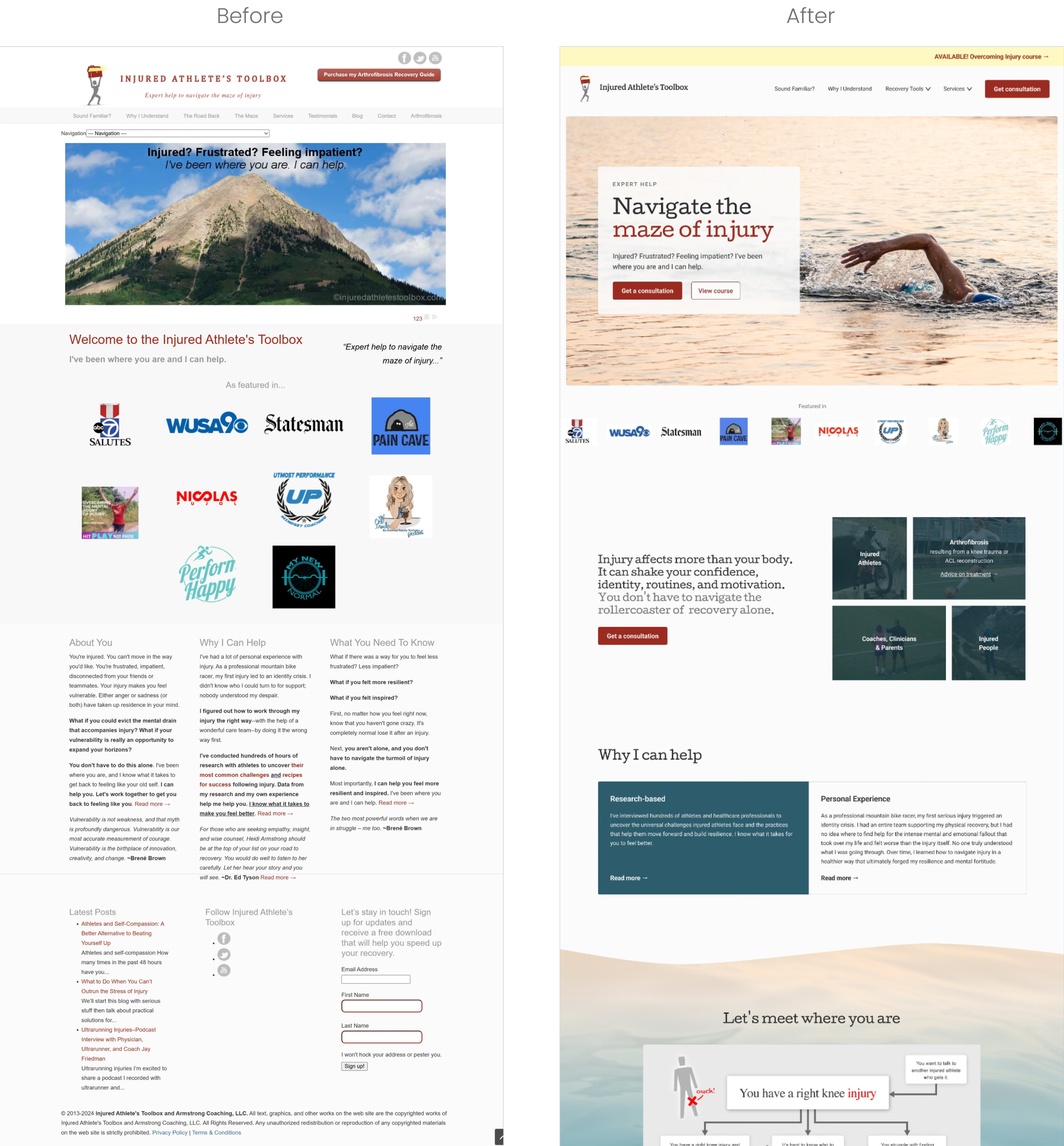
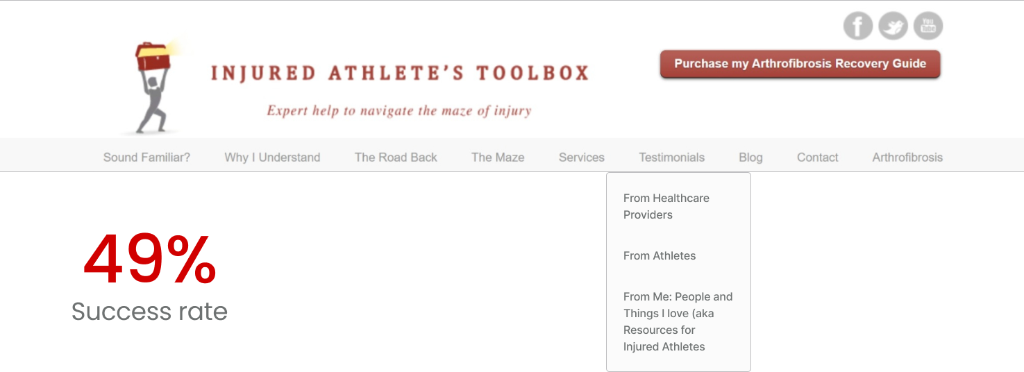
9 top-level pages overlapped in purpose
Unclear labels made it hard to know where to start.
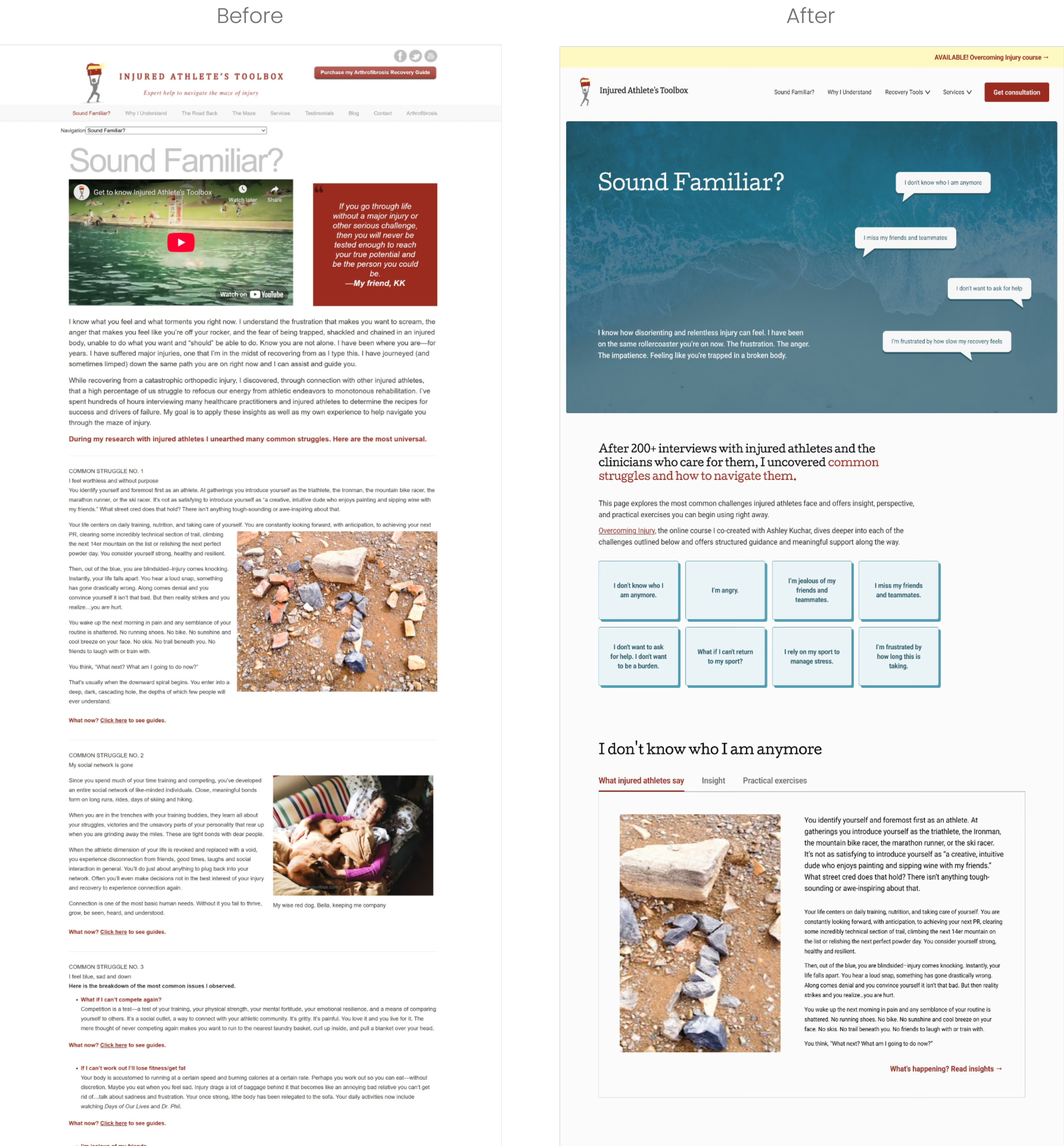
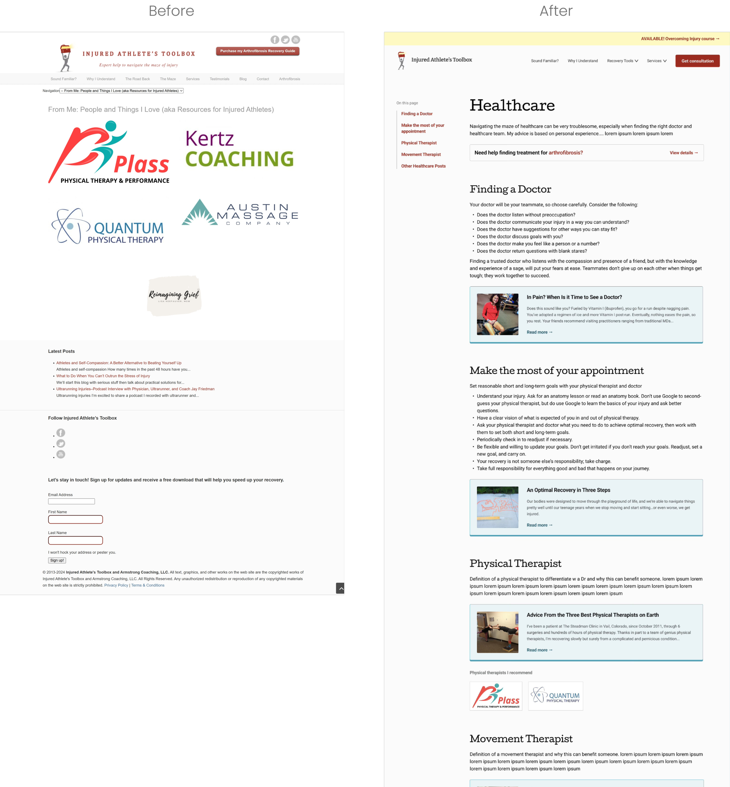
Dense text forced users to scroll endlessly.
The design felt outdated, so users may not know that this is an active site.
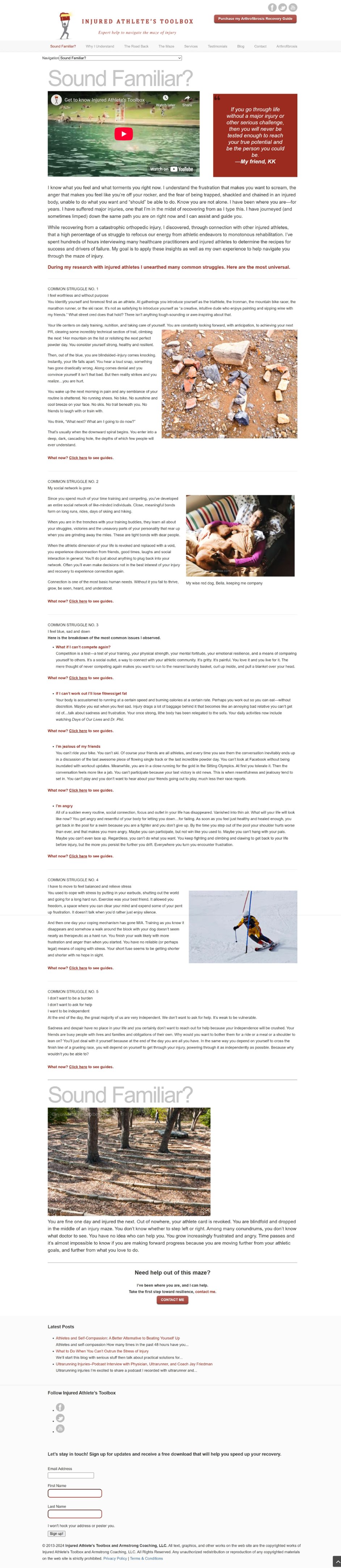
Most visitors—injured athletes—were already emotionally drained. The site needed to guide, not overwhelm, while earning trust from both athletes and healthcare professionals.
Solutions
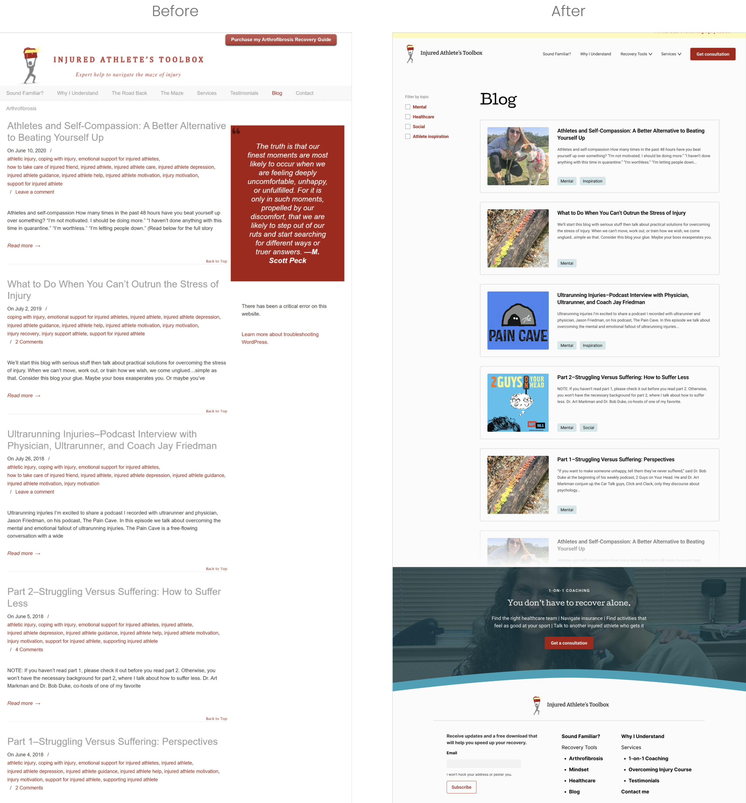
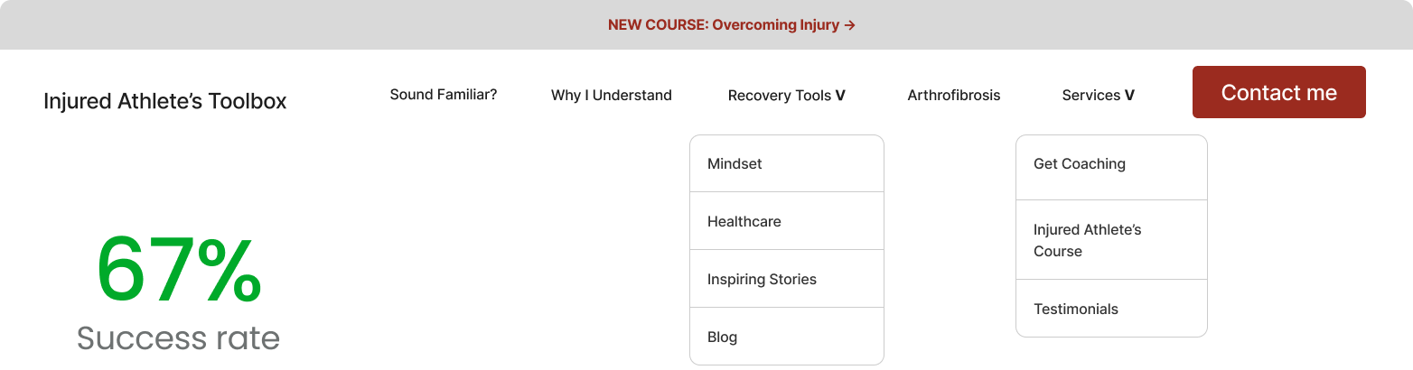
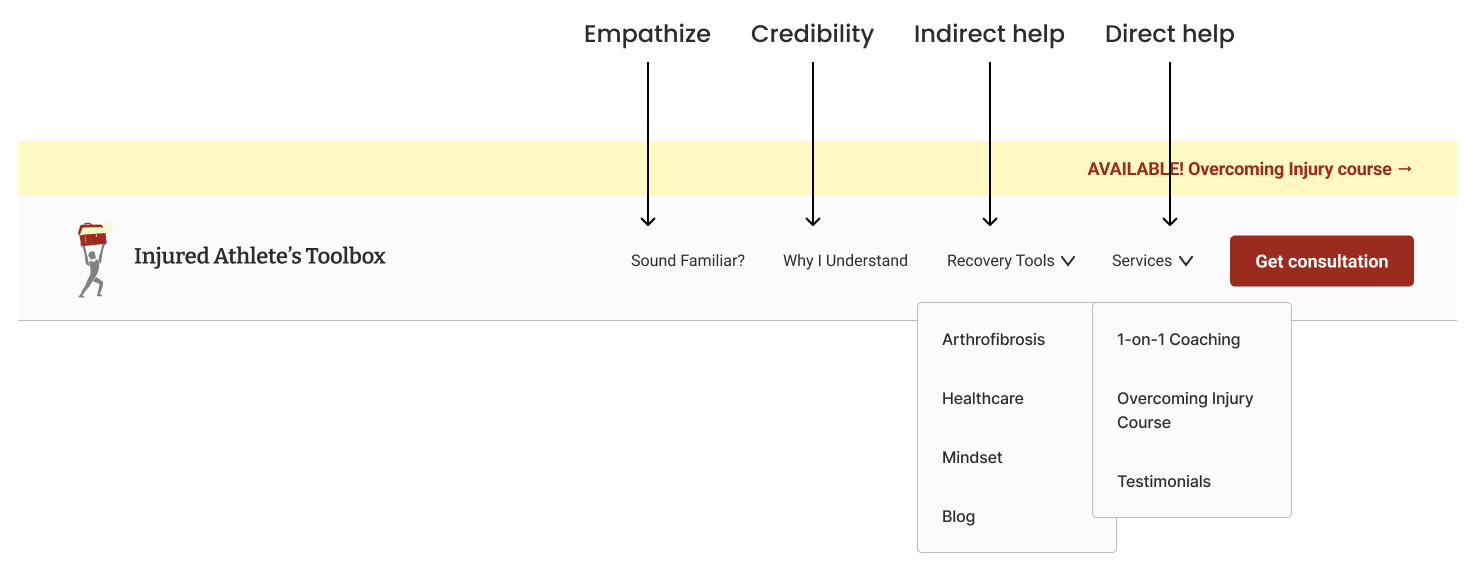
Navigation Bar: Reduced nine top-level items to five clear categories written in plain, empathetic language.
Page Flow: Added a short “next step” at the end of each page—either Book 1-on-1 Coaching or Read Next—to reduce decision fatigue.
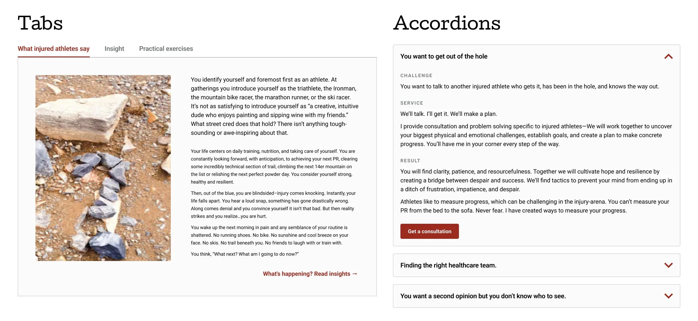
UI Design: Organized dense content with tabs, accordions, and tables of contents, making long pages easier to scan.
Design System: Created a calm, modern design with soft blues, rounded corners, and wave accents to mirror reassurance and recovery.
Understanding the User
Familiarize with User’s Mindset
Since I hadn’t experienced a major injury, I started where users do—Google and Reddit.
Google: IAT appeared 34th for “arthrofibrosis.” Sites above it were clinical and detached, while IAT was the first to speak with warmth and empathy.
Reddit: Posts revealed deep frustration with medical care. Quotes like “I just don’t know who to trust anymore” underscored the need for credibility.
This helped me see that users don’t just want information—they want to feel understood before taking action.
Card Sort Study - How do users group information?
Since this is a content heavy website, the most vital aspect would be the site’s structure. We need to organize the content, so they’re not overlapping or scattered. A card sort will first tell us how users naturally group content.
Most common group names: Mindset, About, Coaching, Resources.
We need to take this a step further: Resources is too vague; Coaching may be a bit confusing as some may assume it’s for coaches.
Two Tree Tests - Which Navigation bar is more successful?
After testing both the original and new site structure, I found that:
Users couldn’t distinguish between pages like The Road Back, The Maze, Blog, and Sound Familiar?
Important healthcare content was buried under “Blog.”
Users’ priorities followed a pattern: empathy → trust → guidance.
The Final Structure
After many iterations and trade-offs, I restructured based on what users were seeking for: empathy then action. Since most users are drawn to the client’s personable writing, it should remain consistent in the navigation bar as well.
Designing for Comfort
Limit the Flood of Information
I designed for the mobile version first. This sets a design constraint to ensure users are not viewing too much at once. Since users have to scroll through so much content, we need to use components that will help users get answers quickly:
Anchor links, accordions, and tabs so users could jump to what mattered most.
Use a calm design system: soft blues, rounded corners, wave accents.
Guide by ending every page with two options.
Reflection
Trade-offs at every corner
This project reminded me that clarity and empathy can coexist. Designing for users in distress means constantly balancing trade-offs—reducing clutter without stripping depth and simplifying without dumbing down.
By focusing on structure, tone, and emotional flow, I transformed a dense information site into a reassuring guide for recovery—one that helps athletes feel understood first and supported every step after.